Creating new web experiences

Creating
new web experiences

Creating new web experiences

Easy navigation to find the right insurance plan and services with fewer clicks by intuitively guiding users more efficiently.

role

Competitor Analysis, Information Architecture, Exploration and Wireframing

Project Overview

Project Overview

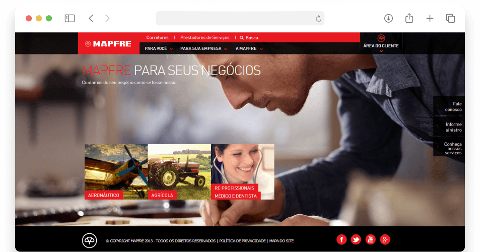
I was part of the team involved in a complete redesign of the existing website, with the main focus on adding new functionality, improving navigation, creating fresh content, and improving the overall 'look and feel'. We then validated how users found relevant content and interacted with the new functions.

Goals

Goals

Cards

Cards

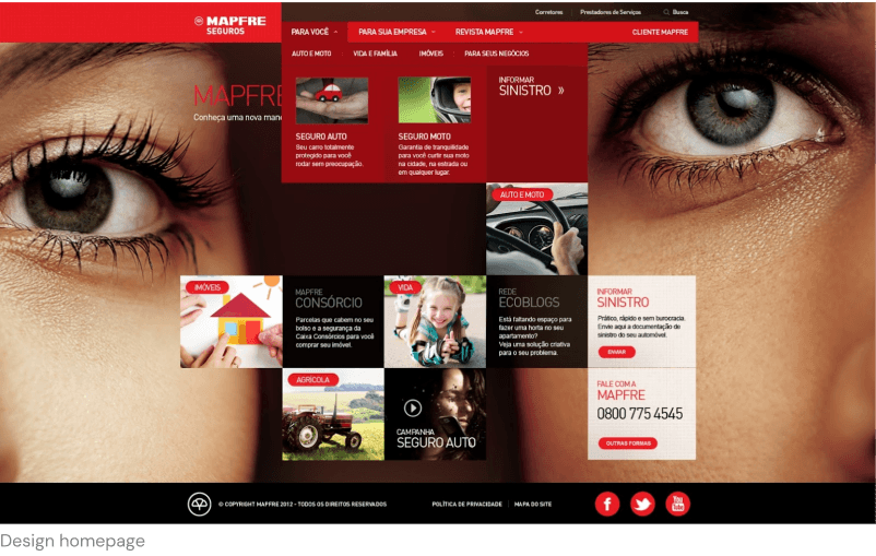
A trendy idea of a card-based layout on the homepage to highlight the main features
and contents.

Easy to navigate

Easy to navigate

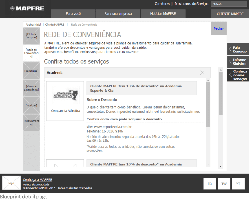
Helping users to navigate is essential to keep them engaged. Easy menus help users to keep browsing content.

Content with one-click

Content with one-click

Research and testing with card sorting generated a new IA. I redesigned the menu so that all items are on the same
visual level.

Research and testing with card sorting generated a new IA. I redesigned the menu so that all items are on the same visual level.

Research and testing with card sorting generated a new IA. I redesigned the menu so that all items are on the same visual level.

Conducting competitive research

Conducting competitive research

The competitor analysis revealed the following:

The competitive analysis revealed the

following findings:

Accessibility

Apply accessibility best practice.
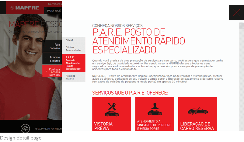
Report a claim

More users want the ability to access the website quickly to report a claim.

 This helps increase the service level and engages with the customer.

Service Assistance

Customers expect website features to help them make decisions. Successful websites use wide help channels that predict the best option for customers.

Rewards club

Most competitors incorporate benefits to customers by offering a reward for their loyalty.

Most of the competitors incorporate benefits to the customers offering a reward for

their loyalty.

Conducting analysis

Conducting analysis

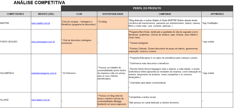
I undertook a performance analysis on Mapfre's websites for Chile and Colombia, covering:

Branding

content, online presence and interactivity.

Navigation

easy to navigate, clicks and search, speed and uploading images.

Engagement

contact, online chat and social media.

Business

products (types of insurances), agents and service providers.

The analysis showed that Mapfre Chile has better performance on all four points listed above. Resulting in an intuitive website, easy to navigate and therefore we used the website as a guide to the content hierarchy process.

Wireframing

Wireframing

During this process, I started to design how the information's structure and layout could be applied across every web session. A lo-fi clickable wireframe was used to test navigation and validate with the client. Once approved, the design team started to work on creating the layout.

During this process, I started to design how the information's structure and layout could be applied across every web session. A lo-fi clickable wireframe was used to test navigation and validate with the client.

Once approved, the design team started to work on creating the layout.

Final design

Final design

Conclusions & learnings

Conclusions & learnings

What I have learned

What I have learned

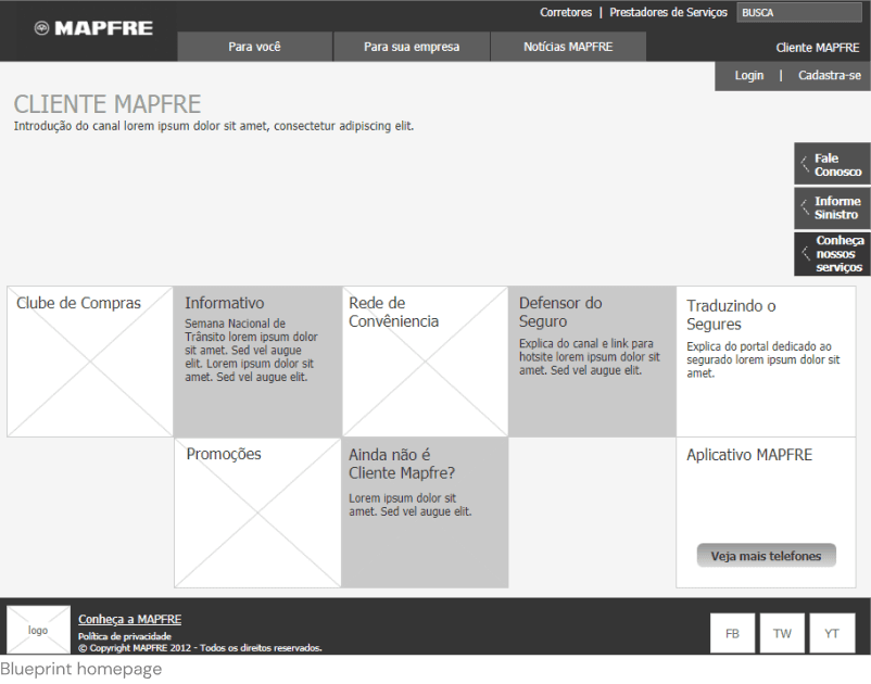
Audiences can become frustrated when they can't find the content they need or when the content isn't relevant to their goal. This can lead to users leaving the website early. It's best to filter information to only display the relevant content.

Do not hesitate to say ‘Hi! - Olá’.

I woould love to tell you more about the fantastic projects I have previously worked on, or we can chat about creating something even more exciting together.