role
User Experience Researcher, User Experience Designer, Information Architect and Usability Testing
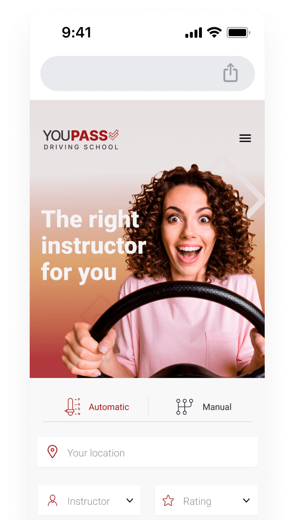
Choosing a suitably qualified driving instructor who can adapt to a learner's teaching needs and has a fully insured, well-maintained car is a crucial decision when starting to drive, especially when considering the costs.
Your investment in tuition gives you the grounding for a lifetime of safe driving, so picking the right instructor is essential.
With so many driving schools out there, it makes it hard to decide which one will suit your individual needs. This is made even more difficult as you don't know if instructors are any good, there's no easy way to rank their performance, there's no information on what the student will be learning in each lesson, nor a way to easily see the feedback after a lesson is over.
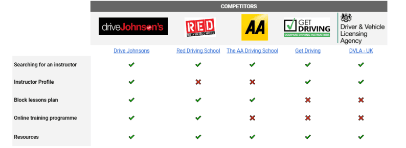
While I was planning the interviews, I conducted a competitive analysis to see what is currently on the market, what these services do well, and what they could improve upon.
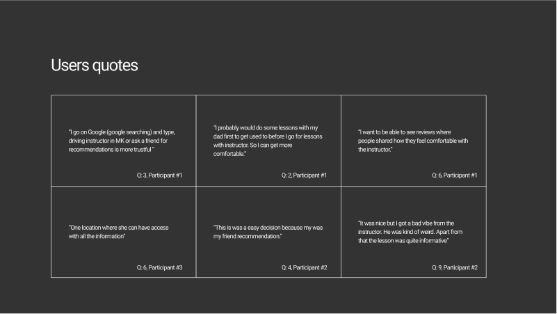
I interviewed five new learner drivers to understand their motivations and define some constraints. From here, I was able to form a primary person.
5 of 10 questions asked:
Why did you want to learn to drive?
How did you find the school/instructor?
What was the most challenging part of choosing who to pick?
How do you usually book a lesson?
How would you want to receive feedback after taking driving lessons?

Persona was based on all the learner drivers I interviewed, as well as real-world situations and problems. This helped me to strategize what features are necessary and which can be left for later development.
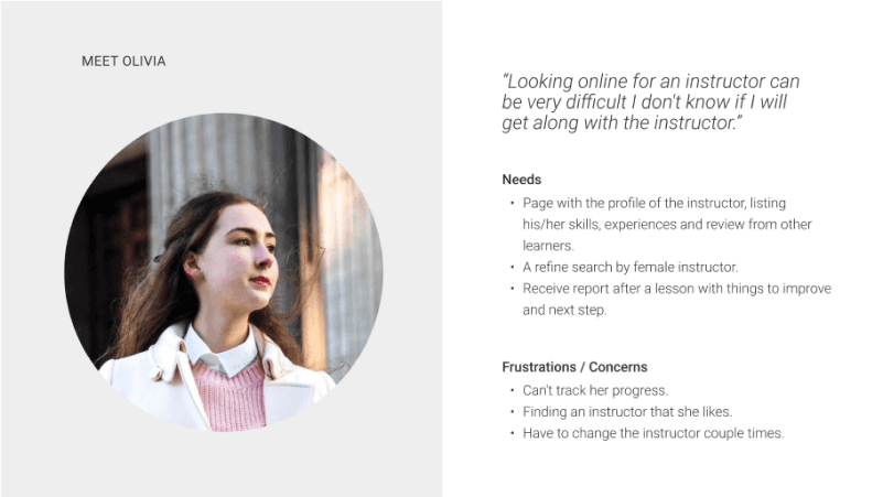
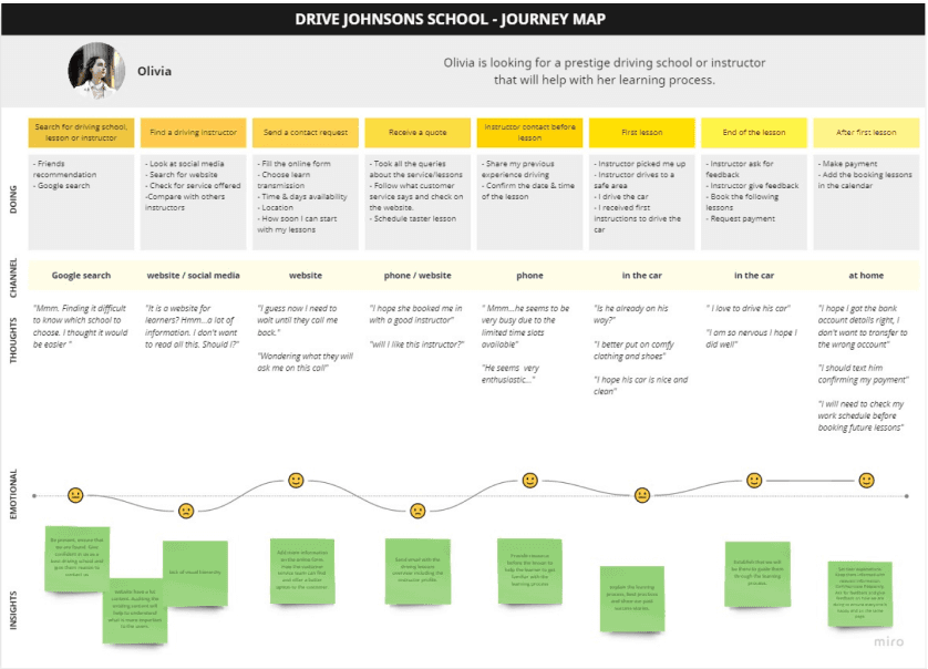
By creating my persona journey map, I could illustrate how Olivia (my persona) behaves and her thoughts while accomplishing her goals. This helped me discover any pain points or moments of delight.
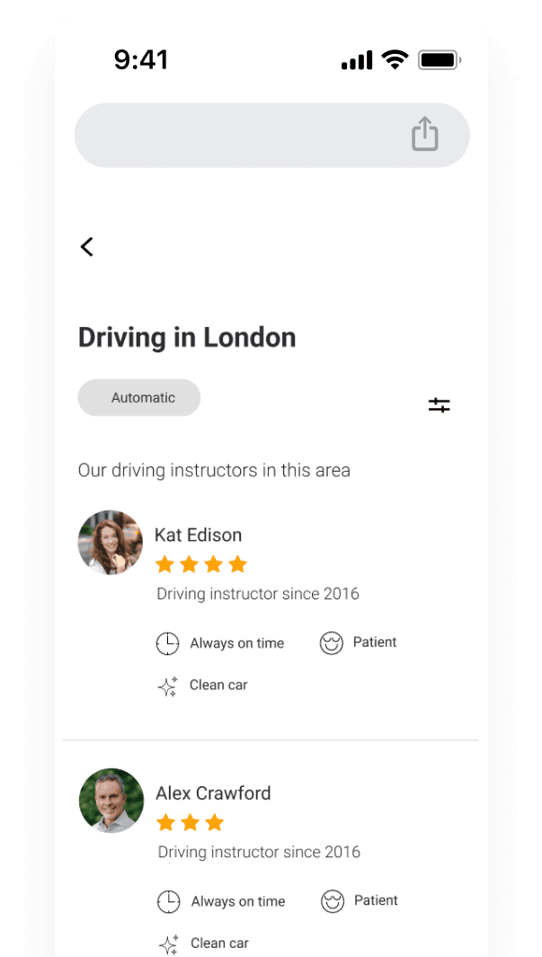
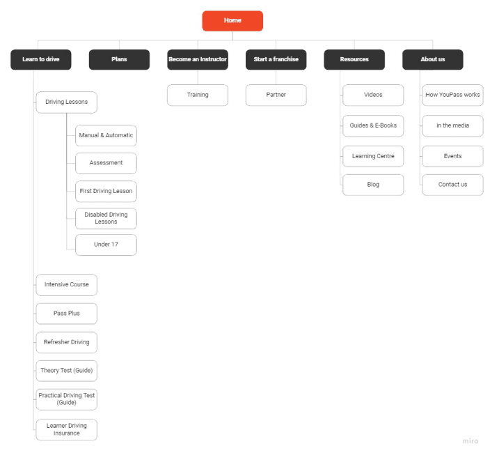
While building sitemaps, I considered all the research I had gathered so far, the user personas, journeys and competitor analysis. This helped to inform the structure of the information architecture and how my primary features should be mapped out.
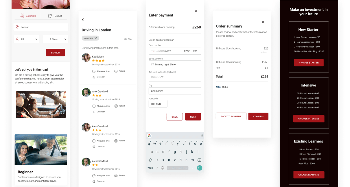
I designed a mid-fidelity prototype for my three core features and took my user persona through the feature build.
Core Features:
Search – recommendations that are relevant to their original query, along with any specific product recommendations
Purchasing plan – displaying all the benefits and costs for the available plans
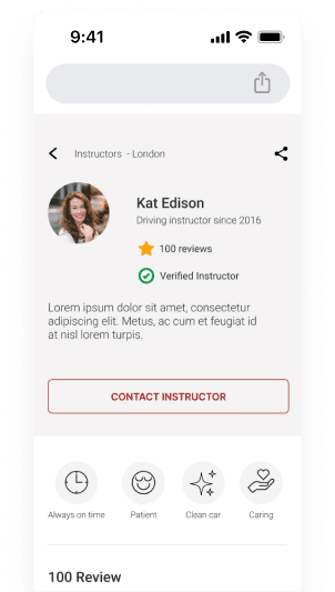
Contact – have any questions answered by an instructor and book a consultation through a contact form
Users are shown relevant search recommendations for their queries and any specific products they need. Although their original query may have been unsuccessful, the search subtly directs them to discover something new that they may be interested in.

The test aimed to assess how the navigation worked, the information flow and the mental models related to searching for an instructor. I also wanted to understand whether the proposed solution was on the right track. Once five people had participated, I began testing my low-fidelity prototype.
I observed and documented whether the participants understood what we are about to proposal, the value of the three core features, and how to achieve the essential functions.
The usability test was conducted as a moderated an unmoderated study via video call and Maze.
Scenario #1
Find an instructor and contact them:
You are planning to start your learning journey behind the wheel and your location is in London. Use this website to find an instructor with a good review and contact them.
Scenario #2
Main Findings
What worked
Most of the participants found the prototype easy to navigate, comprehensive, clean and effective.
Things to improve
More info about the instructors on the home page.
Clarification around why I would be entering my postcode in the search

After compiling feedback gathered from usability testing the main alteration to the website was to aim to transform the way people find instructors.
From having a CTA to open filtering system


A/B Test: I also observed the participants' preferences when searching on the homepage. Do they prefer to follow steps to narrow the search results, or would they rather search directly from the homepage? Users found the steps too long, asking if I could reduce the number of steps to search.
Next: After usability testing, I then collected the data into a usability testing report. Participants' recommendations and areas of improvement were noted using a rainbow spreadsheet. Updated, high-fidelity screens were created based on their recommendations.
What a participant said
Louise (feedback from user testing)
The website was designed to tackle a real problem – helping users find instructors that would fit their needs rather than spending hours searching on different web platforms.
YouPass went through: gathering data, filtering through the data, designing, testing and delivery. Mentor and senior design feedback was also applied.
That being said, there is still more room for improvement to take this platform to the next level and deliver an even better user experience.